Graphic Design
Translating complex ideas into intuitive visual identities and functional digital experiences.
The Objective
As a Design Intern, I worked to translate conceptual brand ideas into a cohesive visual reality. My goal was to create digital assets that felt modern, playful, and versatile across both software interfaces and physical media.
Logo Development & Iteration
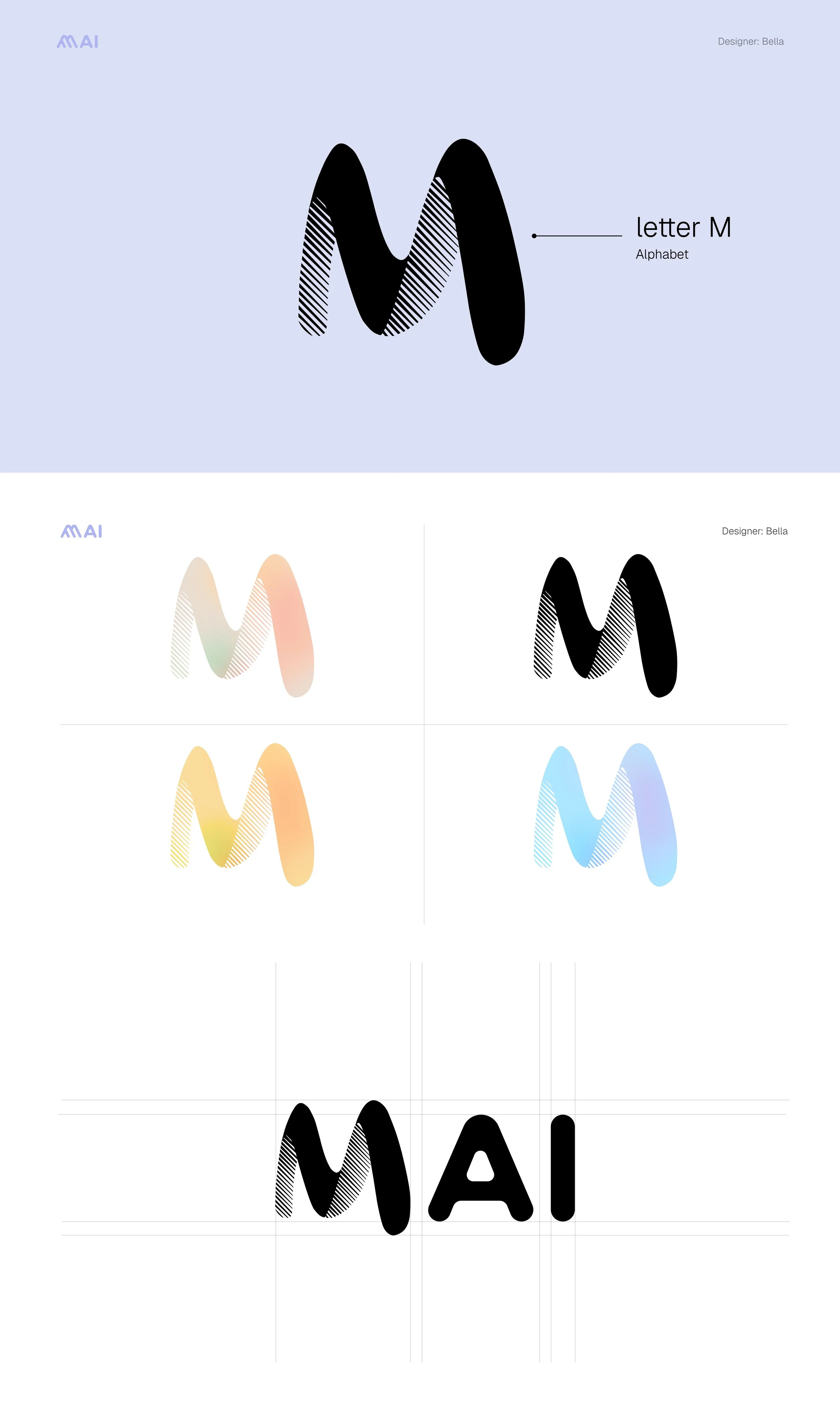
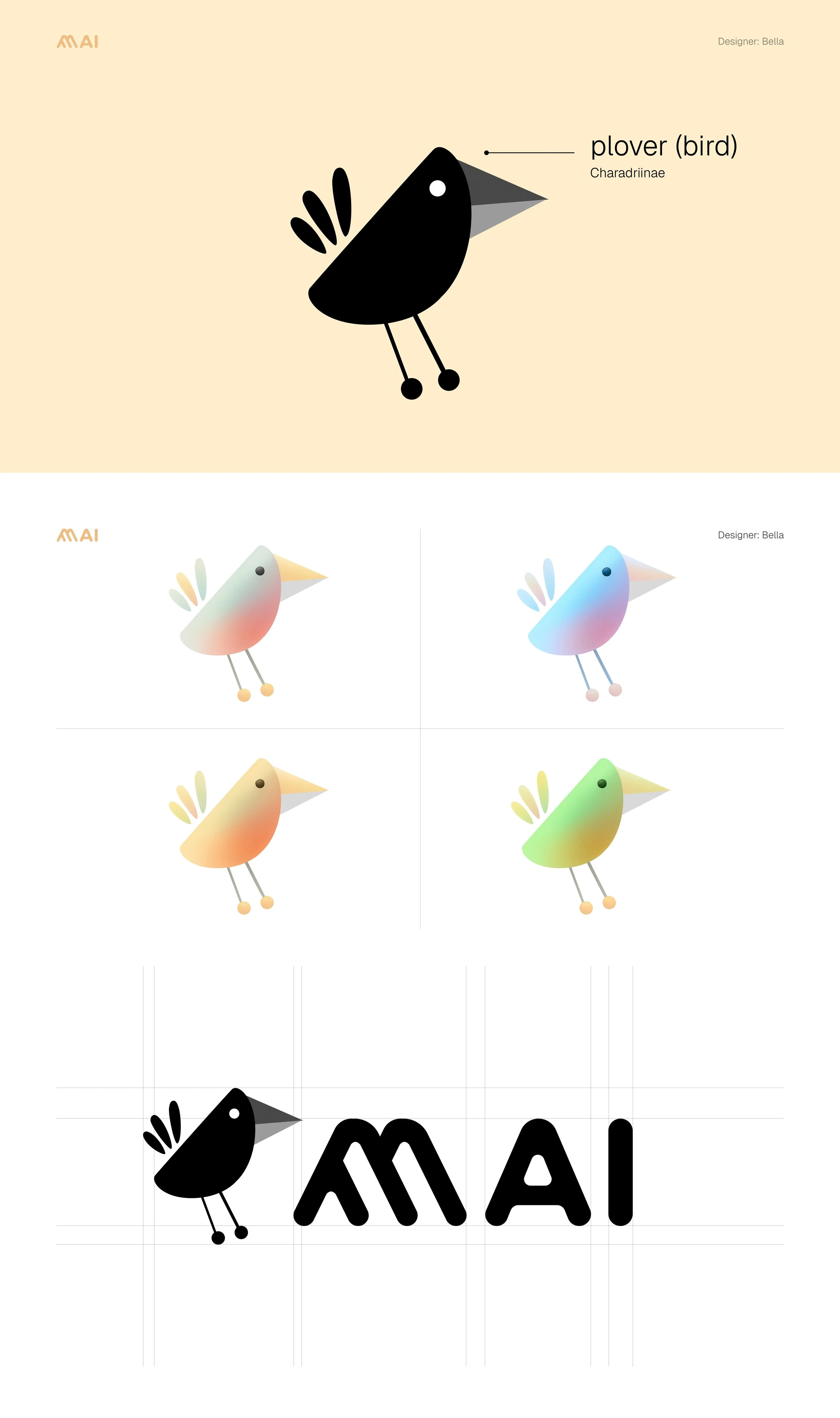
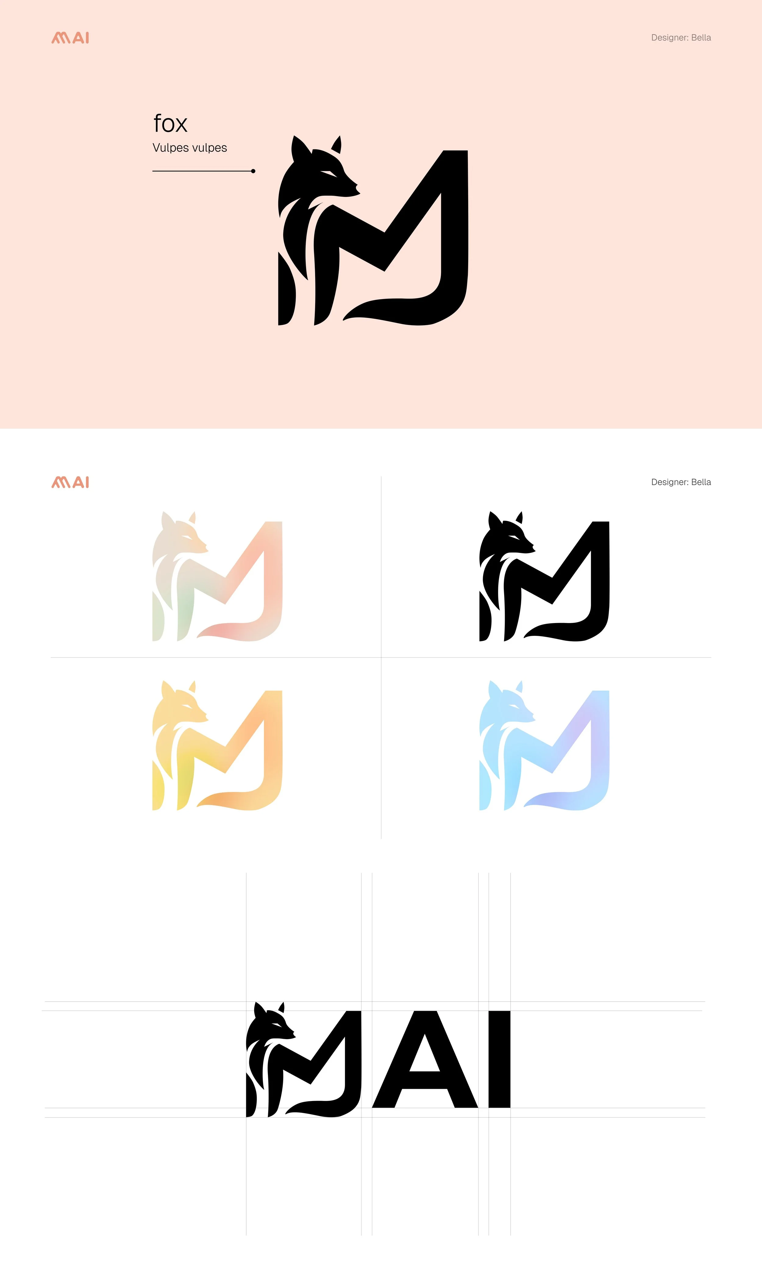
I experimented with various line weights and color gradients to ensure the brand motifs—specifically the "M" letterform and the bird and fox characters—maintained their integrity across different backgrounds.
Visual Adaptability: The "M" logo was designed with a halftone texture to provide depth in digital spaces.
Character Motifs: I developed the "Plover" and "Fox" icons to give the brand a friendly, approachable personality.
Systematic Design: By testing these icons in both vibrant gradients and solid black-and-white, I ensured the brand remains recognizable in any context.
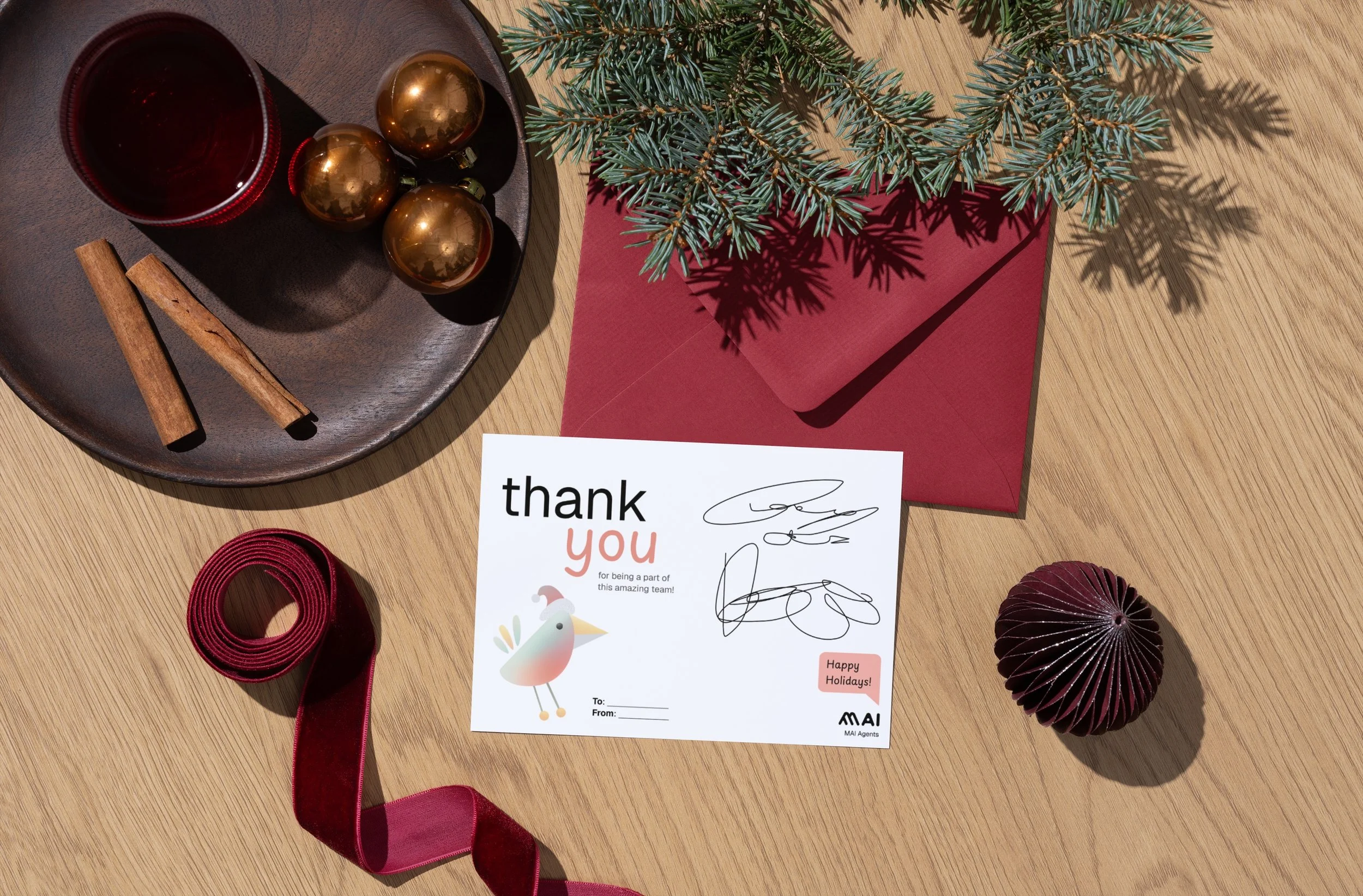
From Screen to Print
A key part of my role was bridging the gap between digital design and physical production. I applied the brand system to tangible assets, such as holiday thank-you cards, ensuring that the colors and character illustrations translated perfectly from the Figma canvas to printed material.
Collaborative Process
This project was a collaborative effort. I worked closely with UI Designers to produce digital assets using Figma, ensuring that every icon and logo variation aligned with the broader product interface and the company's rebranding goals.